Online Magazine User Experience
User Experience | Content Design | UT Austin, Dell Medical School
Project Overview
TxDOT was updated their 2012 website. The information architecture, user experience, and interface were outdated. The existing information architecture was based on the organizations structure. Information was also categorized based on the assumption users wanted to, or would, view information by user types (driver, government, business, etc).
Leaders at Dell Medical School wanted to an update their online magazine. The existing site limited functionality, poor user experience, and unflattering design.
The Goal
My goal was to improve functionality, content exploration and refresh the design. Another challenge was focusing stakeholders from the initial 22 target audiences to just three.
Opportunities
Improve user experience and content exploration.
Provide an entirely new kind of experience.
Update the information architecture.
Build a sustainable approach to content design.
Research
My qualitative research revealed some interesting things like people consumed the content through a quarterly digest sent when a new batch of stories were added. People were used to and liked consuming the content in a magazine like content structure. We used this information to shape our experiences in our wireframes.
My role
I handled content design, user experience, user interface design the project midway through development. My focus was creating and implementing a scalable design system, component designs, and updating focused user experiences.
Audience Personas
After narrowing down the target audiences we distilled them into three audience personas and the types of information they seek.
The Seeker
In search of services, advice or practical insight, they need clear, concise information.
The Observer
Interested in monitoring, they’re in search of facts that prove the value proposition.
The Prospector
Potential partners in search of inspiration and opportunity to engage.
Wireframes
We developed wireframes to help define the user experience before developing designs. In the wireframes we refined experiences for features that mimic a magazine like presentation of content. The homepage groups the latest content into an ‘issue’. Site navigation let users browse content from past issues and individual articles contained sidebar navigation for other stories in the issue.

Homepage

Article Page

Search Results Page

Past Issues Page

Sign-up Page
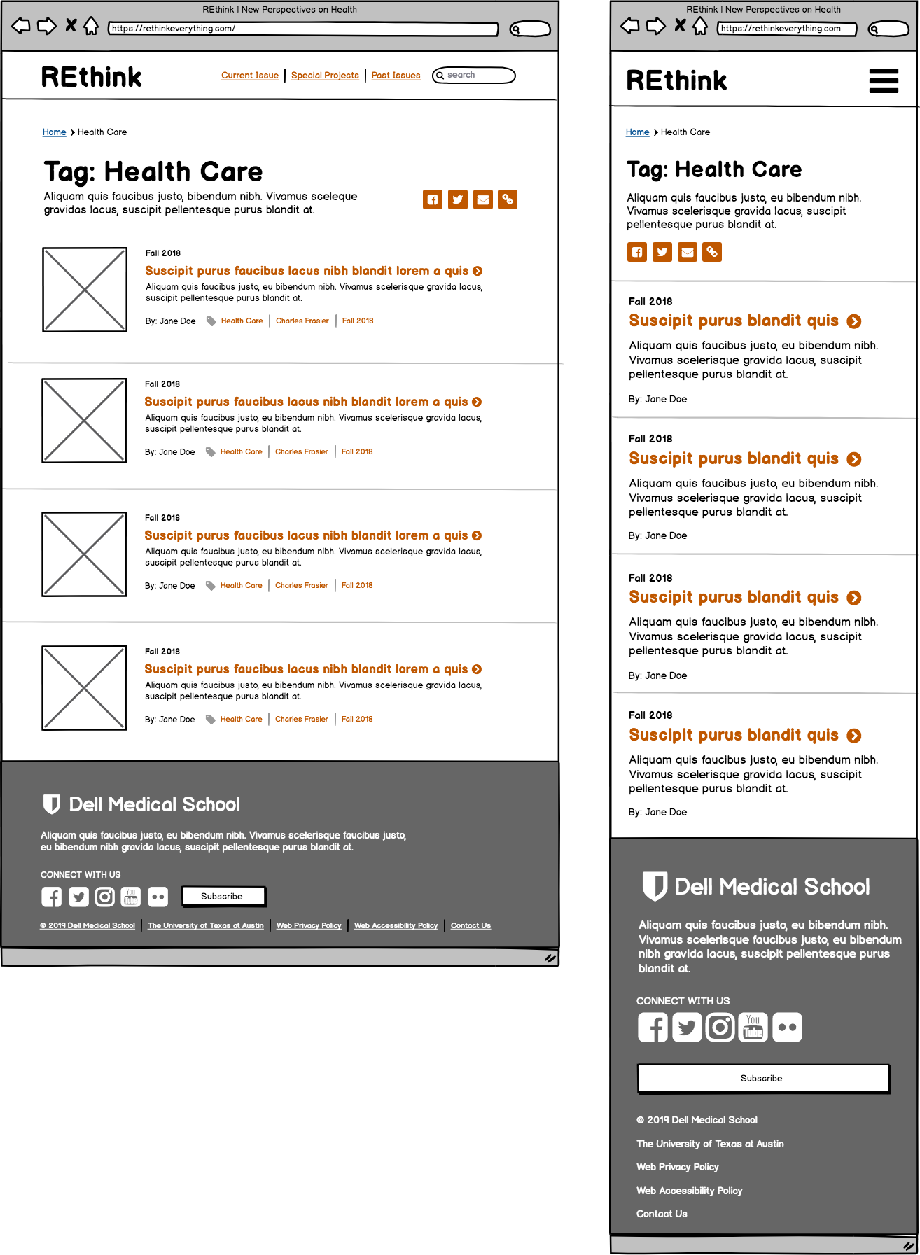
Tags Page
Designs
The design are informed by the wireframes and provide different concepts for the look and feel for the site.
Version 1

Version 2

Version 3

Final Design
The final site design was an offshoot of design 3 (above). The main reason this design was chosen was the drip feed feature. We could release stories in batches called issues but the site also facilitated releasing stories one at a time in a drip feed. A drip feed was attractive as a tool to grow the audience. If new content continually dripped out, users are more likely to return in between issue releases. At the time of this case study was written, the new site was live for only 5 months and data was still being gathered before analysis.

Homepage

Article Page

Issue/Collections Page