Establishing Data Visualization Standards
Data Design | Content Design | UT Austin, Dell Medical School
Overview
The Texas Department of Transportation (TxDOT) successfully developed and implemented comprehensive data visualization guidelines to address inconsistencies in data presentation across the organization. We engaged with our data community, overcame challenges, and created standards that have significantly improved data literacy and consistency organization-wide. The guidelines have become a cornerstone in TxDOT's data-driven transformation over the past three years.
Opportunity
As a large state transportation organization, TxDOT deals with vast amounts of data across multiple departments—from engineering and infrastructure to human resources and safety campaigns. The organization identified a critical issue: inconsistent data visualization practices were hindering effective communication and decision-making. Without standardized guidelines:
Data was presented inconsistently across departments
Visualizations varied widely in quality and effectiveness
Staff had different levels of understanding about data presentation best practices
External vendors produced materials with inconsistent visual languages
The organization lacked a unified approach to data storytelling
My role
I wore many hats of this project. A few key highlights are:
Engaged stakeholders and users.
Wrote initial documentation structure and managed production processes.
Led discovery discussions with stakeholders and users to ensure alignment.
Reviewed and approved documentation to maintain clarity and effectiveness.
Coordinated development of templates and resources from data analysts.
Stakeholder Engagement
TxDOT wisely recognized that successful guidelines required buy-in from actual users. They engaged their data analyst community of practice—an existing network of professionals who regularly work with data—to participate in the development process. This collaborative approach ensured the guidelines would address real needs and pain points.
Comprehensive Audit
The team conducted a thorough audit of existing data visualization practices by:
Reviewing printed materials containing data elements
Analyzing existing dashboards and digital data presentations
Examining reports and documents with data components
Identifying inconsistencies and best practices across the organization
Balancing Complexity
A significant challenge was determining the appropriate level of content depth. The guidelines needed to serve multiple audiences:
Technical data analysts requiring specific standards
Non-data professionals who occasionally work with data elements
External vendors who produce materials for TxDOT
The team had to create guidelines accessible enough for beginners while providing sufficient depth for experienced analysts.
Iterative Feedback
Before publishing, draft guidelines were shared with the community of practice for feedback and refinement. This iterative process ensured the standards were practical, understandable, and addressed the organization's diverse needs.
The Guidelines
The finalized Data Visualization Guidelines were published on TxDOT's website and include:
Standard color palettes optimized for data visualization
Typography recommendations for clarity and accessibility
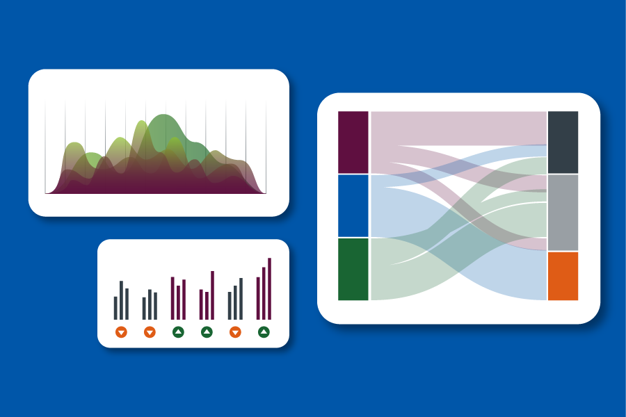
Chart and graph type selection guidance
Best practices for creating accessible visualizations
Examples of effective and ineffective data presentations
Templates and resources for common visualization needs
Implementation & Maintenance
To ensure continued relevance and accessibility, TxDOT:
Published the guidelines on their public-facing website, making them available to both internal staff and external vendors
Placed the brand manager in charge of maintaining and updating the guidelines
Established a regular feedback loop with the data analyst community of practice to identify needed updates
Integrated the guidelines into the broader TxDOT brand standards
Results & Impact
While formal metrics haven't been collected, the guidelines have driven significant qualitative improvements:
Increased Consistency: Data visualizations now follow a cohesive visual language across the organization
Enhanced Data Literacy: The guidelines have contributed to elevated understanding of data throughout TxDOT
Organizational Transformation: Over the past three years, TxDOT has experienced substantial growth in embracing data to guide organizational innovation
Improved External Communications: Vendors now have clear standards to follow, ensuring consistent quality in externally produced materials


Key Insights
The most significant revelation from this project was discovering just how pervasive data is throughout the organization. From engineering to HR to safety campaigns, data touches virtually every aspect of TxDOT's operations. This underscored the critical importance of data literacy across all departments and roles.
Lessons Learned
Inclusive Development: Engaging actual users in the development process led to more practical and useful guidelines
Accessibility Matters: Creating guidelines that work for varying levels of data expertise required careful balance
Organizational Culture: The guidelines have been a catalyst for broader data culture transformation
Continuous Improvement: Regular engagement with the community of practice ensures the guidelines remain relevant
Final Thoughts
The TxDOT Data Visualization Guidelines represent more than just a set of standards—they've become a foundation for organizational change and improved data communication. By addressing inconsistencies and establishing clear best practices, TxDOT has elevated its data literacy and embraced a more data-driven approach to fulfilling its mission of providing safe and reliable transportation solutions for Texas.
The success of this initiative demonstrates the value of standardization, stakeholder engagement, and accessible guidance in transforming how large organizations approach data visualization and communication.