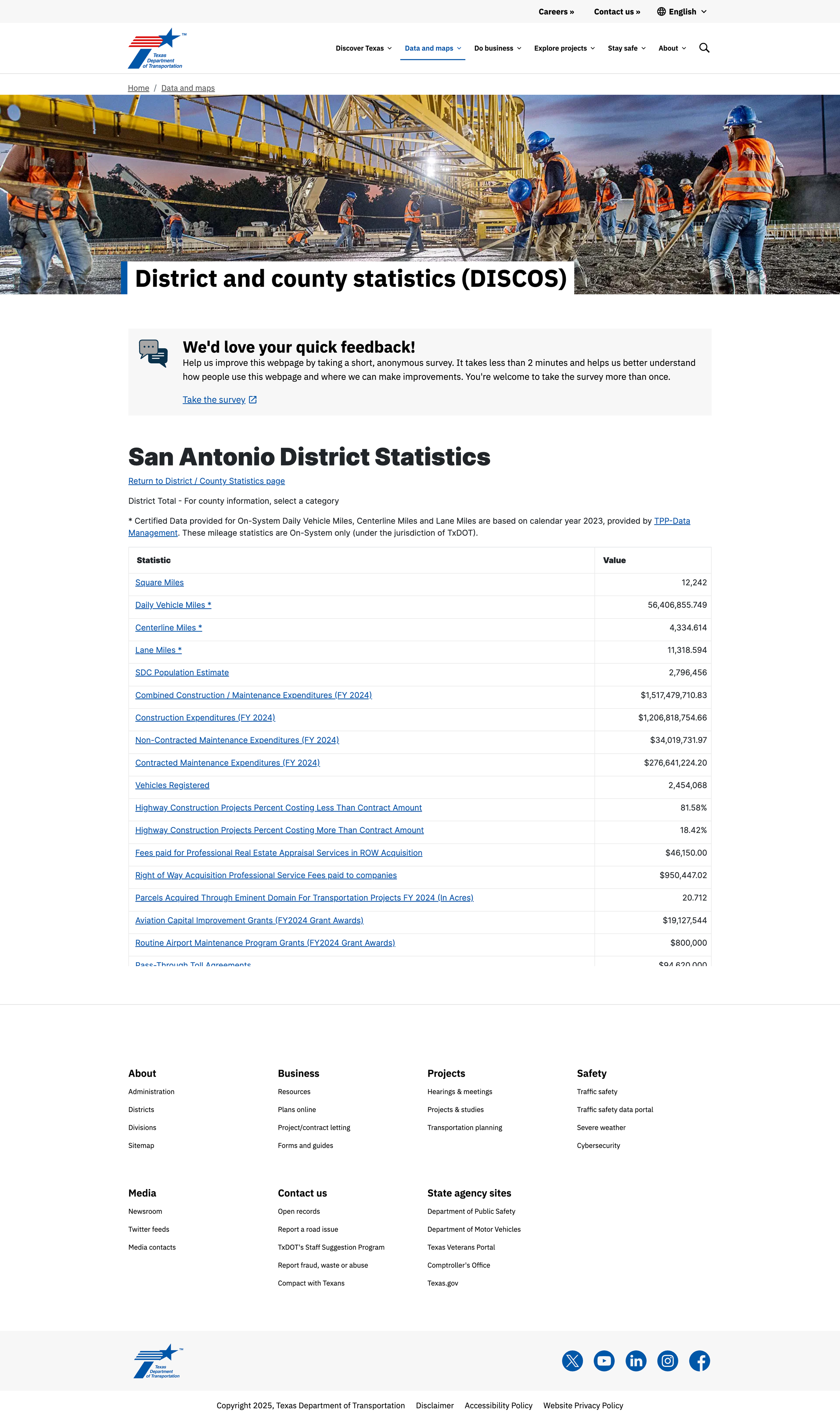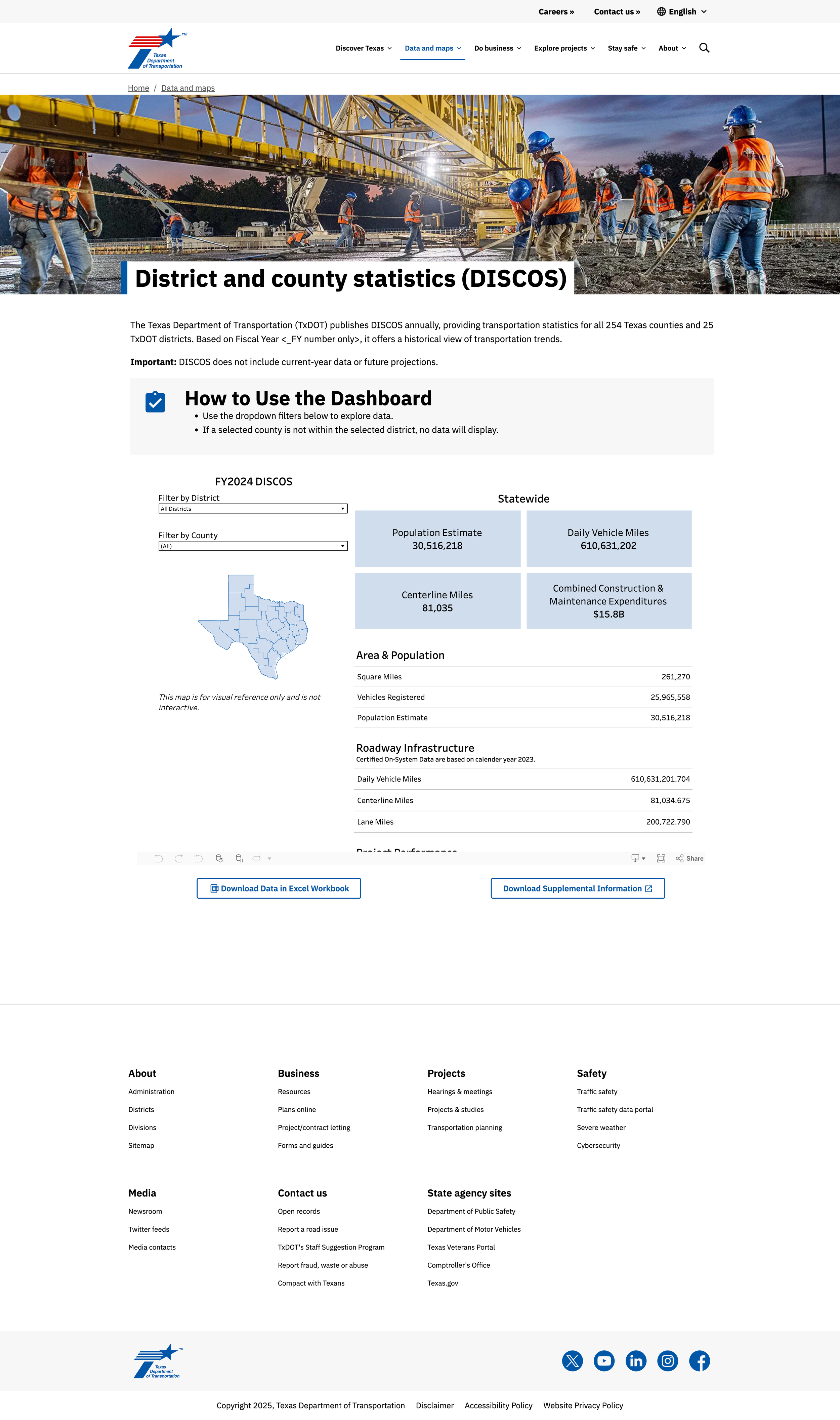
Before

After
District and County Statistics (DISCOS) Case Study
Texas Department of Transportation
Project Overview
Timeline: 7 months (Jan – Aug 2025)
Team: UX Designer, UX Manager, Portfolio Project Manager, Data Analyst
Tools: Tableau, Figma, Microsoft Forms. Adobe Experience Manager
The Challenge
The original DISCOS digital experience required users to interpret and navigate dense table across multiple webpages. Internally, updates required coordination with the IT department to push even the smallest data change distracting developers from higher-value work.
For both employees and the public, the experience did the opposite of what data should to, instead of clarity, it created dependency.
The Solution
We turned a high-friction experience, into a self-serve dashboard that works — for everyone.
We replaced a custom-built application with a user-friendly, Tableau-powered dashboard that data owners can now update without IT support. The redesign improved the experience and compliance with the digital design system.
Important: All insights and outcomes shared are intended to demonstrate general UX process and impact. Specific internal system details have been generalized or omitted to ensure security and privacy compliance.
Results
50% reduction in how cumbersome the system feels
46.4% reduction in perceived inconsistency
43.2% reduction in the need for technical support
40.6% increase in perceived integration of system functions
Overall usability sentiment rose by 25 – 32% across most positive metrics
$12,889 total savings (annual estimate)
512.95 hours in time saved (annually) for general public and employees
$4.37 return for every $1 invested in this project, a 337% rate of return.
My role
During the initial phase of the project I was the UX Manager and Project Manager. As a team member transitioned away, I took over UX Design and conducted research and analysis.
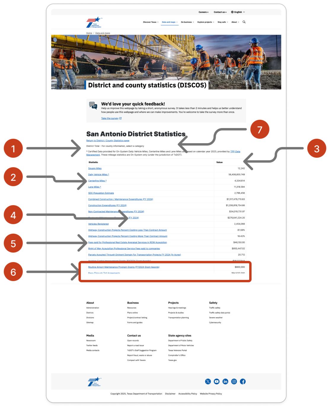
Heuristic Review of existing application
While the application is in use, it lacks visual indicators for data freshness.
Industry terms like “Centerline Miles”, “Right of Way Acquisition” may be confusing for members of the public.
There’s no way to filter or even sort data columns.
Some rows are long or contain multiple acronyms leading to misclicks.
Table categories and terms require prior knowledge without a glossary of terms.
Visual hierarchy is flat, all rows look equally important.
Power users don’t have shortcuts leading to a loss of efficiency.

UX Involvement
Discovery & Research
Interviewed internal users
Reviewed application data logs
User research (System Usability Scale (SUS) survey to gather baseline user sentiment.
Heuristic review of existing application to identify areas of improvement.
Design & Prototyping
Use low fidelity wireframe to introduce data dashboard approach.
Testing & Integration
Conducted second SUS survey to measure user sentiment change for redesigned approach.
Behavioral Insight
People don’t resent complex data. They resent having to decode the interface behind it. Removing cumbersome navigation and providing a streamlined interface yielded positive results.
“We didn’t dumb it down. We stopped hiding it in the filing cabinet with 12 locks.”
Measurable Change
Below are results from a SUS survey of the existing system (before) and the redesign (after).
| Metric | Before | After | Change |
|---|---|---|---|
| I find the various functions in the system are well integrated | 3.2 | 4.5 | +40.62% |
| I imagine most people would learn to use this system very quickly | 3.6 | 4.75 | +31.94% |
| I think that I would like to use this system frequently | 3.4 | 4.25 | +25% |
| I feel confident using the system | 3.7 | 4.5 | +21.62% |
| I think this system is easy to use | 3.8 | 4.5 | +18.42 |
| I would need support of a technical person to use the system | 2.2 | 1.25 | -43.18% |
| I think there is too much inconsistency | 2.8 | 1.5 | -46.43% |
| I find the system is cumbersome to use | 2.5 | 1.25 | -50% |
| I need to learn a lot of things before I could get going | 2.3 | 1.25 | -45.65% |
Survey Highlights
Significant Usability Gains: Users reported strong improvements in perceived system integration, ease of use and confidence, highlighted by a 40.6% increase in perceived integration and a 31.9% increase in learnability.
Reduced Friction: Agreement with negative usability statements (e.g. “cumbersome to use,” “too much inconsistency”) dropped by over 45%, indicating that the redesign successfully addressed key pain points.
Positive User Sentiment: Qualitative feedback praised the layout and clarity of information, reinforcing the quantitative gains and suggesting high user satisfaction with the updated experience.
User Feedback
“I love the layout. Key info in squares at the top. This looks really good.”
“Excellent draft of the DISCOS information. I recommend implementing it.”
“The design itself works well. I struggled with the excel spreadsheet and all the tables, but worked my way through it.”
Survey Sample Size Consideration
While the usability surveys yielded valuable insights, it’s important to note that both before and after survey’s were based on relatively small sample sizes (10 & 4, respectively). This limits the statistical generalizability of the findings. However, the consistency of responses and the clear directional trends—particularly of the usability improvement and reduced friction—provide strong qualitative support for the effectiveness of the redesign. Future evaluations may benefit from broader participation to validate and expand upon these initial results.
Based on the small sample sizes (n=10 before, n=4 after), the 95% confidence intervals for reported usability improvements range widely (e.g. ±50–58%). While trends are strongly positive, future evaluations with larger sample sizes will allow for more statistically robust conclusions.
Internal Impact: Simplified Process & Ownership
Before the redesign, updates to the tool required coordination between the data owners and IT, adding delay, cost, and complexity.
Now:
The data team can directly update data, in real time, using Tableau.
No IT development time is required.
The custom application will be decommissioned, removing tech debt.
This change not only modernized the overall experience for users, it also eliminated an unnecessary system and empowered the data owners.
“We turned a custom app into a self-serve, up-to-date, and sustainable tool, and freed up IT resources in the process.”
What we learned
We didn’t accept the request at face value but asked “How might we improve the overall user experience and make it easier to manage.”
Empowering content owners saves time and improves overall experiences.
User experience research before and after creates a clear vase for user experience investment.
Conclusion
The usability redesign of the DISCOS digital experience led to measurable and meaningful improvements in user satisfaction, ease of use, and confidence. The results validate the design decisions and highlights area for continued refinement, such as supplemental documentation and data presentation.
This case supports the approach for sunsetting custom-built tools when off-the-shelf self-serve solutions are available.
Helps prove long-term value of involving UX, not just to improve usability, but to reduce maintenance and overhead.